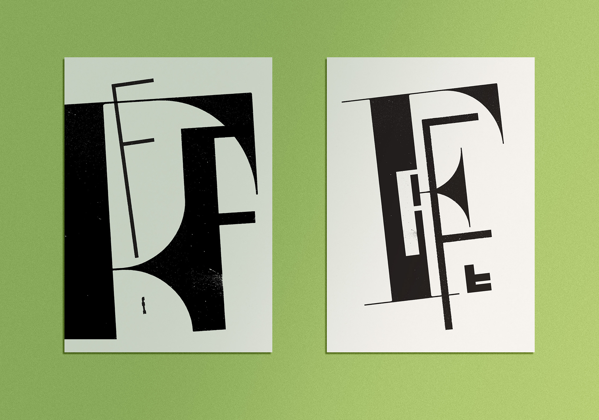
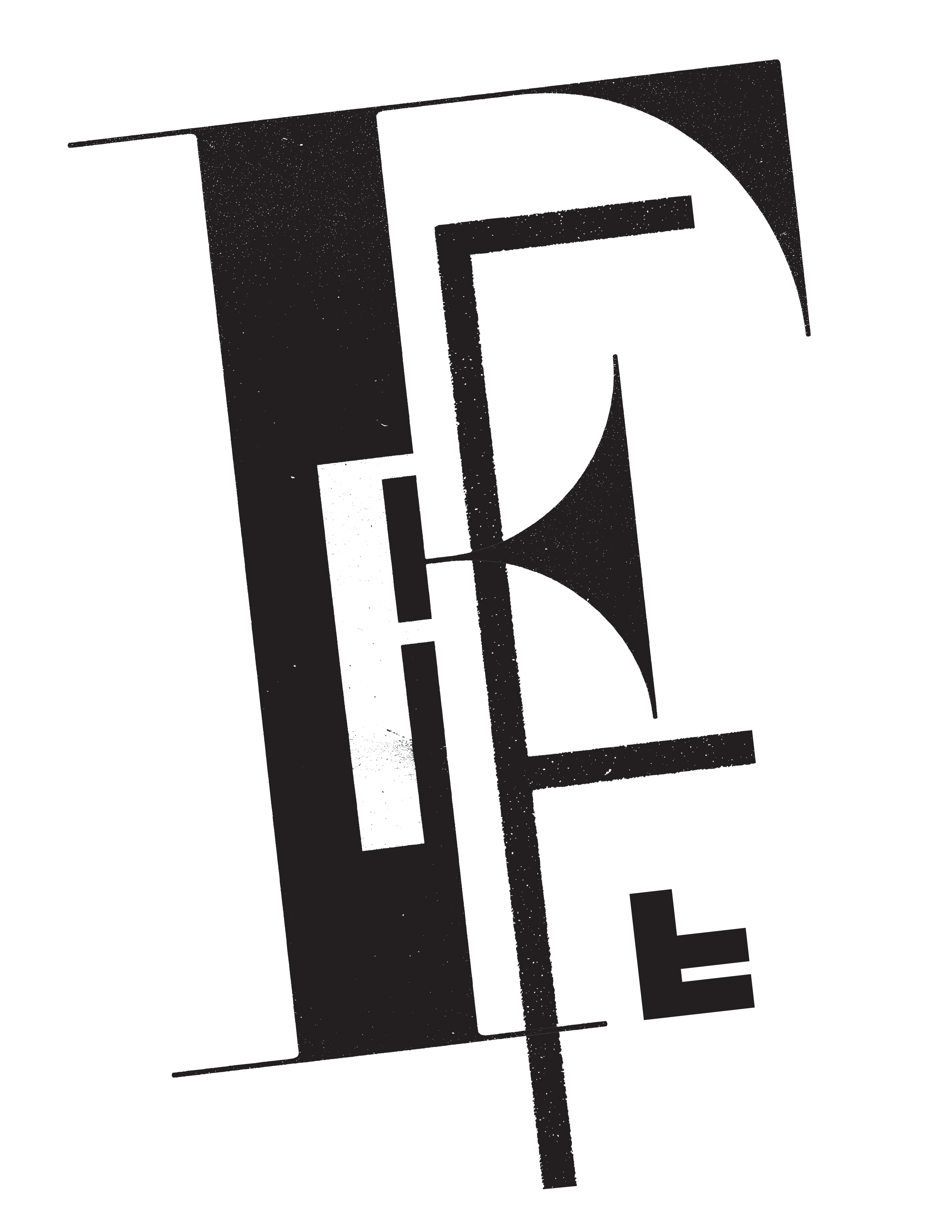
Typographic Contrast Studies – Found Letterforms
Spring 2024 – 17"x22" Inkjet Prints
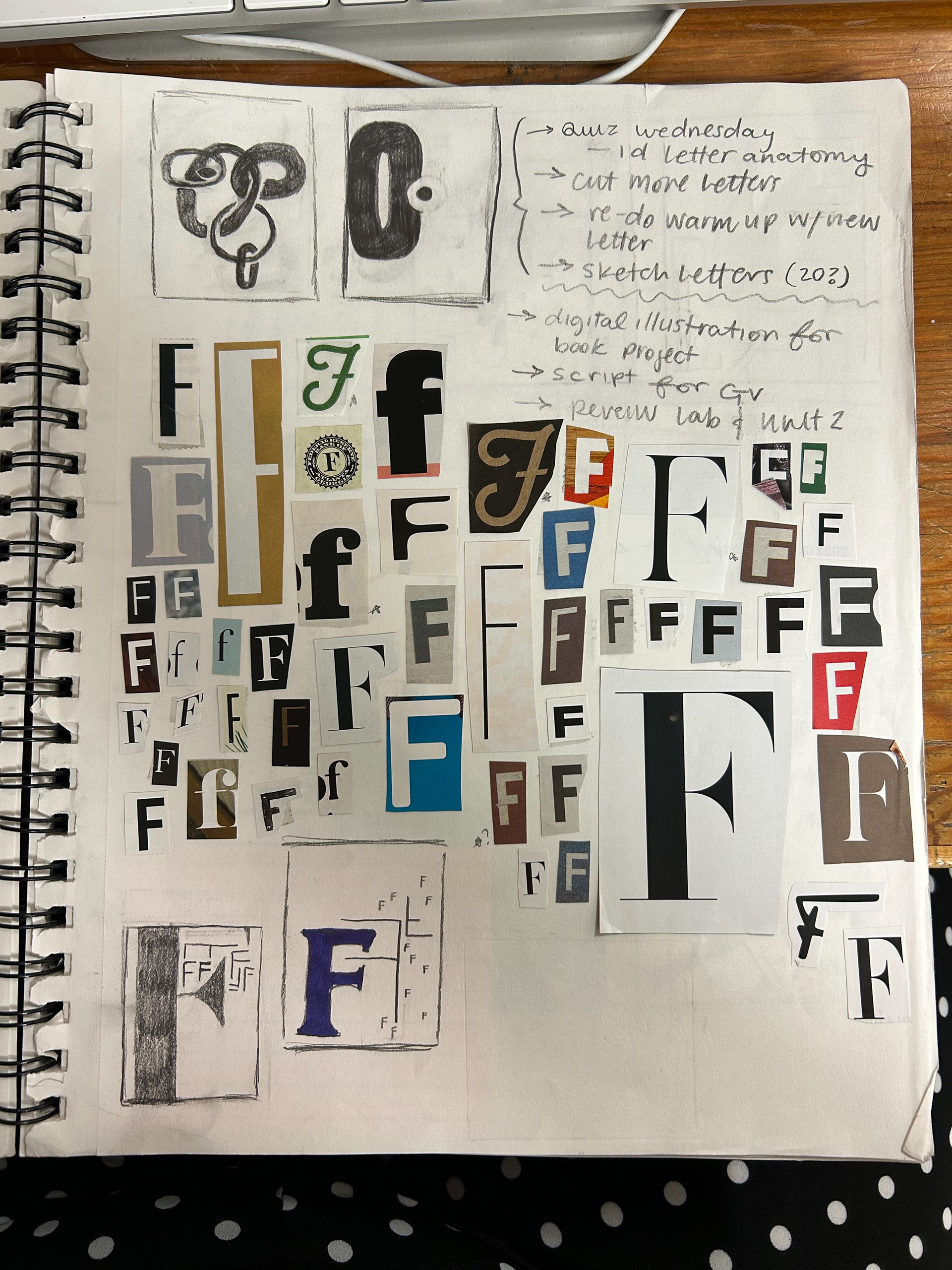
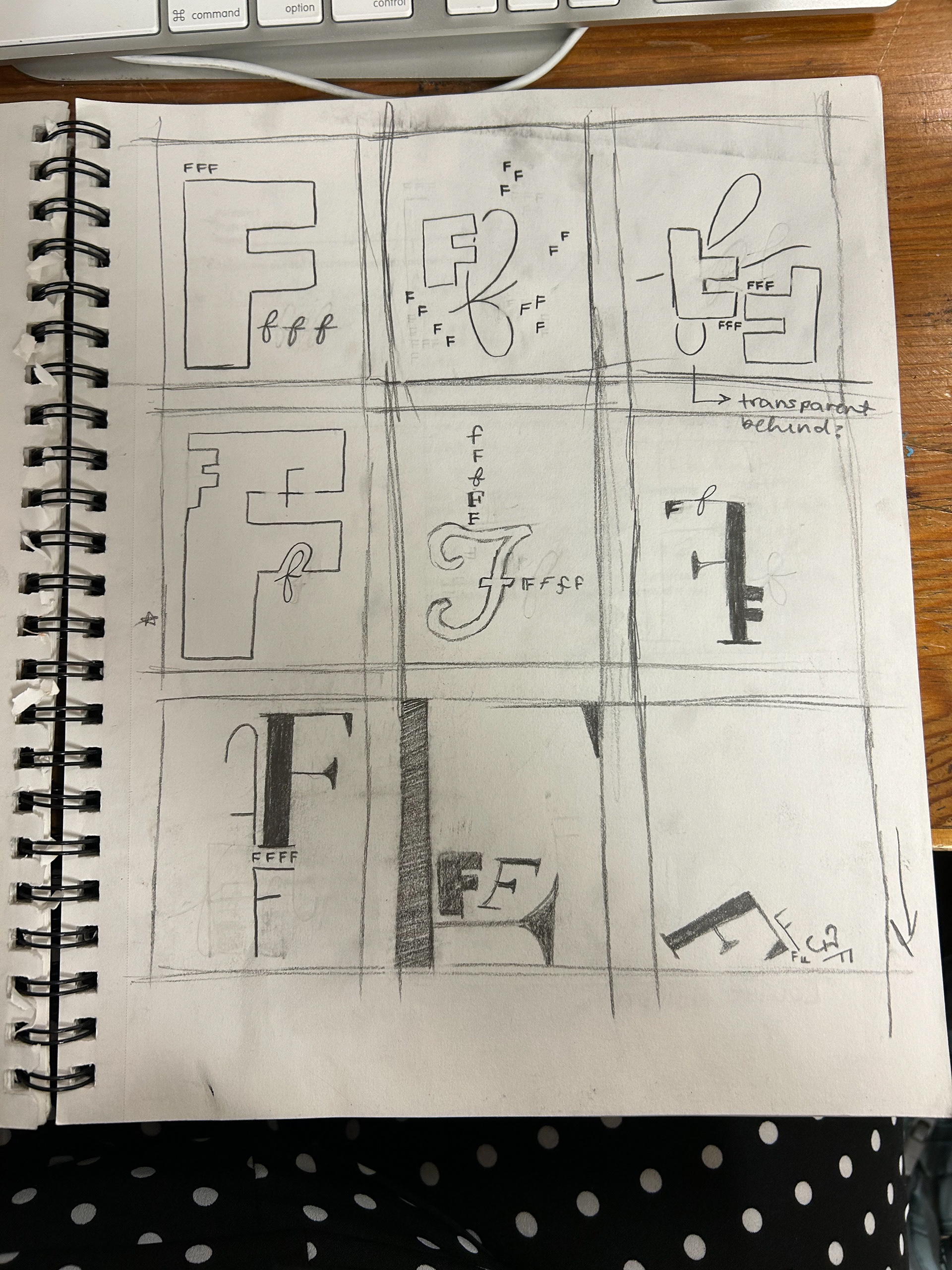
This series is a visual exploration of typographic contrast, centered around the letter F. Each of the two black and white compositions combines found typography—sourced from packaging, magazines, and other printed materials—with digitally created letterforms.
The goal was to play with contrast in multiple ways: serif vs. sans-serif, bold vs. delicate, structured vs. chaotic. By stripping away color, the focus shifts entirely to the form, texture, and rhythm of the type itself. Layering and composition were used to create tension and harmony within the letterform, allowing the distinct voices of each F to interact and coexist on the page.